Picture this: your branded work truck rolls past a potential customer at 65 mph. They have about three seconds to register your company name, understand what you do, and mentally note how to reach you. That is it. Three seconds, and the opportunity is gone.
Here is the hard truth about vehicle wrap design that most fleet buyers learn the expensive way. A wrap that looks stunning in a design proof can be completely unreadable on an actual road. Tiny fonts, cluttered layouts, and low-contrast color choices that seem perfectly fine on a monitor become invisible blurs the moment your vehicle hits highway speed.
The good news? There are clear, proven design rules that fix all of this before you ever print a single panel.
In this guide, you will learn exactly how speed and distance change what works in wrap design, which fonts and colors hold up at 70 mph, and the most common mistakes that quietly drain your advertising budget. You will also get a practical pre-sign-off checklist so you can review any design proof with confidence before giving the green light.
Why Highway Speed Changes Everything About Vehicle Wrap Design
Your fleet wrap is a moving billboard, and it doesn't slow down for anyone. A passing driver or pedestrian gets roughly three seconds to read your brand, understand what you do, and catch your contact info, all from somewhere between 20 and 100 feet away. That's not much time.
Here's where most wraps quietly fail. At 30 to 50 feet, low contrast between your text and background makes copy go effectively invisible, regardless of how big the font is or how bold the color looks in a proof. The design that looked sharp on your laptop in a well-lit office is a completely different animal on a cloudy afternoon at 50 miles per hour, viewed at an angle through a windshield.
That gap between "looks great on screen" and "readable in traffic" is the real problem. Commercial fleet graphics need to be designed for motion first, with aesthetics as a secondary concern, not the other way around.
The hard truth is that most failed fleet wraps aren't a printing problem or a vinyl problem. They're a design-for-the-wrong-context problem, and it gets locked in before installation ever happens. Understanding the commercial wrap advantages starts with understanding that a wrap only earns its value if people can actually read it.
The Only Three Things Your Wrap Needs to Communicate
Every effective commercial fleet graphic follows the same three-part hierarchy: brand identity first, core service second, one clear call to action third. Three things.
The most common mistake fleet buyers make is treating their wrap like a business card. They want the logo, tagline, phone number, website, a list of services, social handles, and maybe a QR code. It looks thorough on a proof. On the street, it's a blur nobody can decode before you're already two blocks away.
Decide your single primary takeaway before any design work starts. Everything else gets built around that anchor. Nobody reads an outdoor ad at 70 mph and walks away with six facts. They get one.
In practice, a passing driver should catch your company name and what you do in the first two seconds. The phone number or URL is a bonus for the person who had an extra half second, maybe someone at a red light.
If you're still on the fence about whether a wrap is worth the investment, this breakdown of what wraps deliver versus a paint job puts the value in plain terms.
The Five Design Rules Every Fleet Wrap Has to Follow
Rule 1: Keep every line to five to eight words max. Full sentences, service lists, and taglines blur into a streak at speed. Drivers only have time to take in a few words, so anything longer vanishes before it registers.
Rule 2: Bold sans-serif fonts only. Helvetica, Arial, Montserrat, Futura, Impact. Thin fonts, scripts, and decorative typefaces collapse into visual noise from thirty feet away. If you wouldn't put it on a highway sign, don't put it on your truck.
Rule 3: High contrast, no exceptions. If your brand colors fight each other on a vehicle panel, add a dark background block or white outline behind the text. Legibility beats brand guidelines every time.
Rule 4: One CTA, period. A phone number or a vanity URL, not both. Two options at 65 mph means a viewer remembers neither. Your CTA should be the largest text element after your company name.
Rule 5: Design around the vehicle, not over it. Keep logos, phone numbers, and key copy off sliding doors, hinges, fuel doors, window lines, and body seams. Graphics that cross those breaks distort after installation, and there is no fixing it without a reprint.
For a deeper look at how finish choices affect visual impact on fleet vehicles, our matte vs. gloss wrap guide covers exactly that.
Choosing the Right Fonts and Colors for Custom Vehicle Wraps
Bold sans-serif fonts hold up at distance because of stroke consistency. Every letter has roughly the same line thickness throughout. When a vehicle is moving and you're viewing at an angle, thin strokes disappear. Uniform, chunky strokes stay readable.
Picking the Right Font for Your Brand
Helvetica and Montserrat are solid defaults for most businesses. They read as clean, professional, and trustworthy, which works well for contractors, service companies, and anyone projecting reliability. Impact is different. It's heavy and condensed, built for short bursts of attention-grabbing copy rather than detailed messaging. It fits a high-energy brand and would look out of place on a financial services vehicle.
If your brand font fails the distance test, legibility wins. No debate.
Color Contrast Is Not Just Black and White
High contrast comes in many forms. Deep navy on white, bright yellow on black, white on a rich red or saturated green all pass the distance test because the eye separates text from background quickly. What fails: pastels on white, red on dark blue, light gray on silver. Those combinations blend together past 30 feet.
If your brand palette is naturally low-contrast, drop a solid color panel behind your text block. You keep your brand colors and the text stays readable.
One more thing: busy photographic backgrounds behind copy look great in a proof and fall apart in traffic. Even when the photo and text both look clean separately, they compete visually at speed and text always loses. For more on color and coverage options, see our vehicle wraps page.
Tell us your make, model, and what you have in mind. We'll give you an exact quote, not a ballpark.
Seven Design Mistakes That Cost You Real Advertising Dollars
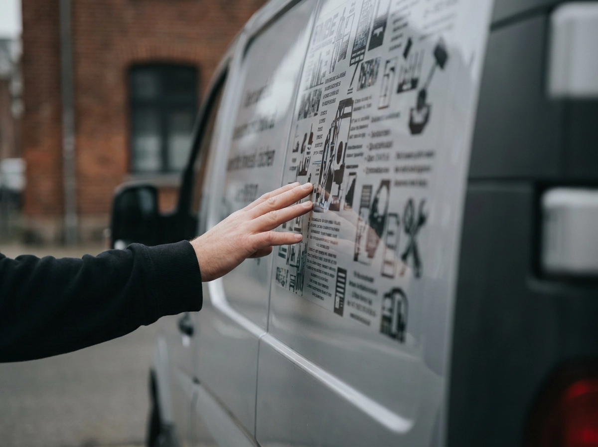
Even good font and color choices won't save a wrap if the overall design has one of these problems baked in.
1. Text overload. If your van lists your company name, tagline, five services, a phone number, a website, and an email address, nobody reads any of it. Pick the essentials and cut the rest.
2. Tiny type. Small type that wouldn't pass a 30-foot readability check becomes invisible in traffic. If someone has to squint, you've already lost them.
3. Designing for the monitor, not the street. A proof that looks crisp on your laptop in a bright office tells you nothing about how it reads on a gray Tuesday afternoon at fifty miles per hour. Real-world conditions are always harder on a design than a screen is.
4. Ignoring doors, handles, and seams. Text or logos that run across panel breaks get stretched, split, or warped in ways that look sloppy and can make critical info unreadable. Consistent placement across panel lines requires deliberate planning before the design is finalized, not after.
5. Low-resolution images. A logo that looks sharp on screen can go visibly blurry when output at vehicle scale, especially on a Sprinter or box truck. Always supply files at full print resolution.
6. Inconsistent branding across a fleet. One nice-looking wrap does not build brand recognition. When each vehicle looks slightly different, the cumulative impact is diluted and the brand impression resets every time someone sees a new truck.
7. Wrong wrap coverage. A partial wrap that ignores natural panel lines looks accidental rather than intentional. Coverage decisions need to follow the vehicle's body lines, not a rectangular template.
How to Map No-Go Zones on Common Fleet Vehicles
Ignoring panel breaks is the mistake most often surviving into a final proof undetected, so it is worth walking through the fix plainly.
Every vehicle type has its own physical interruptions. Sprinter and cargo vans have sliding door tracks, handles, and fuel caps. Box trucks have roll-up door seams that slice through whatever is printed over them. Pickup trucks have bed lines, wheel arches, and tailgate breaks. Each is a potential trap for a logo or phone number.
A no-go zone map marks every one of those features before a single design element gets placed. Door handles, fuel doors, hinge lines, and window breaks all go on the map as off-limits for critical text or graphics. That step alone prevents most panel-break problems that appear on install day.
Once no-go zones are marked, the answer for primary branding placement becomes obvious: the flat panels on the driver and passenger sides, centered between the wheel wells and away from door hardware. That real estate is clean, uninterrupted, and visible from the road.
Vehicle wrap design templates sorted by model are a solid starting point. Just make sure a professional installer reviews placement before you sign off, since templates are a reference, not a guarantee.
At Wrapt Auto Styling, we work from actual vehicle templates for every make and model we handle so key elements land correctly from the first draft, not after a reprint.
When you review a proof, physically trace each panel break on the vehicle and confirm nothing critical crosses one.
Why Fleet Consistency Is a Design Rule, Not an Option
Clean placement across vehicles is only half the equation, consistency between them is the other.
Ask yourself: does every vehicle in your fleet look like it belongs to the same company? If the answer is "mostly," that's a problem.
Brand recall is built through repetition. A customer who sees your van on Monday and your truck on Friday only connects those sightings if the visuals match. Different font choices, shifted logo placement, or an off color between vehicles breaks that connection entirely.
A fleet wrap style guide fixes this. It documents exactly which fonts to use, the precise color values, where the logo sits on each panel, what the CTA looks like, and how much of the vehicle gets covered. Every vehicle that goes through the shop follows the same rules.
The side benefit is speed. When you add a new hire's truck or replace a unit, the design decisions are already made. No back-and-forth, no starting from scratch, no rework after the fact.
For mixed fleets with different vehicle sizes, a good style guide adapts the layout to fit each body style while keeping the core identity locked. The logo stays the logo. The colors don't drift. The CTA stays in the same relative position.
It's a one-time investment that pays back every time you wrap another vehicle.
Your Pre-Sign-Off Design Proof Checklist
Once your style guide is locked in, run through these checks before anything goes to print. They take ten minutes and can save a costly reprint.
1. The three-second test. Cover the proof, then look at it for exactly three seconds. If you can't read the company name, service, and CTA in that window, the layout fails in the real world.
2. Word count check. Count every word on every panel. Anything over eight words per line gets flagged for trimming. No exceptions.
3. Font weight confirmation. Every font in the primary copy should be bold or extra-bold. If you spot a script font, thin typeface, or anything decorative in the main text, ask for it to be replaced.
4. Contrast check. Squint at the proof until it blurs slightly. If the text fades into the background at that blur level, it will disappear at 60 mph from 40 feet away. Add a solid panel behind the text or increase the contrast.
5. No-go zone compliance. Overlay the design on an actual vehicle template and confirm no logo, phone number, or CTA crosses a door seam, handle cutout, window line, or fuel door.
6. Single CTA verification. There should be exactly one contact method on the wrap, and it should be the second-largest text element after your company name.
7. Resolution check. All images and logos must be supplied at full print resolution, ask your installer for their minimum file spec. Screen-resolution files scaled up will look pixelated on a full-size van.
8. Drive-by review. Print the proof at a reduced scale, tape it to a wall, and walk past it briskly from ten to fifteen feet away. It's low-tech, but it works.
At Wrapt, "Simple Process. No Surprises." is how we approach every job, and that starts with making sure the design passes these checks before a single inch of vinyl gets cut.
Takeaways Before You Approve That Proof
The checklist above takes ten minutes; what follows is the reasoning that makes each check worth doing.
Getting the design right before anything hits vinyl saves you real money. Reprints are expensive. Lost leads because nobody could read your phone number at 65 mph are more expensive. Every mile your vehicles drive is a free advertising impression, but only if someone can actually read the wrap.
At Wrapt Auto Styling in Leander, serving the Austin area, we handle both the design and the professional installation. We use premium vinyl from trusted manufacturers, and we back our work with a warranty. You can check out our full vehicle wrap and fleet services to see what we offer.
Get a free quote and we'll get back to you within one business day. Let's make sure your fleet earns its keep.
Conclusion
Nail these fundamentals before any proof gets approved: tight word count, bold high-contrast fonts, a single clear call-to-action, and no critical text across panel breaks.
Consistency across your fleet is not optional. One off-brand van undermines the recognition you've built with every other vehicle on the road.
The stakes are simple. A readable wrap earns impressions on every mile. An unreadable one earns nothing, no matter how sharp it looks in a thumbnail.
At Wrapt Auto Styling in Leander, serving the Austin area, we handle design and professional installation under one roof. Let's build a fleet that works as hard as you do.
Frequently Asked Questions
How much time do drivers have to read my vehicle wrap at highway speed?
Drivers typically have about 2-3 seconds to read your vehicle wrap at highway speeds, viewing from 20-100 feet away. During this brief window, they need to register your company name, understand what you do, and catch your contact information. This is why every design element must be instantly readable and free of clutter.
Why do some wraps look great in design proofs but fail to work on the actual vehicle?
Designs that look sharp on a monitor in a bright office environment face very different conditions in the real world. Factors like motion, viewing angles, weather, lighting conditions (especially gray afternoons), and distance drastically impact readability. Low contrast, tiny fonts, and cluttered layouts that seem fine on screen become invisible blurs at highway speeds. This is why designs must be created for the street, not the screen.
What are the most critical design rules every fleet wrap must follow?
The five essential design rules are: (1) Keep every line to 5-8 words maximum, (2) Use only bold sans-serif fonts like Helvetica, Arial, or Impact, (3) Maintain high contrast between text and background with no exceptions, (4) Include only one clear call-to-action (either phone number or URL, not both), and (5) Design around vehicle panel breaks by keeping logos and critical information away from doors, seams, and hinges.
What should my wrap communicate, and how should I prioritize the information?
Your wrap needs to communicate exactly three things in a strict hierarchy: (1) Brand identity first, your company name, (2) Core service second, what you do, and (3) One clear call-to-action third, either a phone number or vanity URL. Most failed wraps try to pack too much information like multiple services, social handles, and email addresses. Remember, drivers process 1-3 words per second at highway speeds, so only the essentials will register.
Why is fleet consistency important, and how do I maintain it across multiple vehicles?
Fleet consistency is critical because brand recognition is built through repetition. If each vehicle looks different, the visual connection is broken and you start from zero every time someone sees a new truck. Create a fleet wrap style guide that documents which fonts to use, precise color values, logo placement on each panel, CTA format, and coverage specifications. This ensures every vehicle follows the same rules and maintains consistent branding, while also speeding up the design process for new vehicles.